Second Lookdesign review · 6 October 2026
posthog.com
A product analytics, session replay and error tracking platform that stores product and business data so engineers and AI agents can query it and act on it. For Product engineers and technical founders at software companies, mostly self-serve and many on the free tier.
First impression
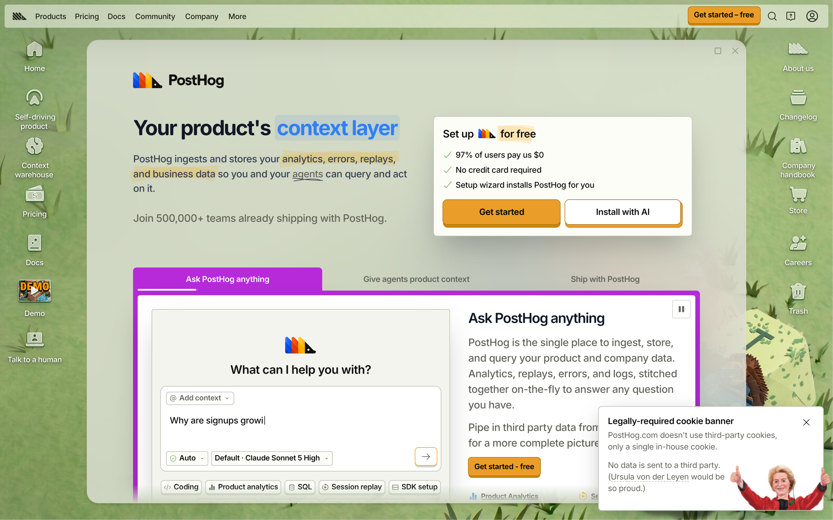

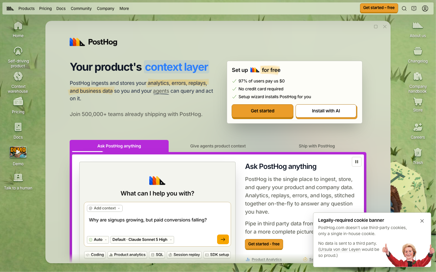
Ten-second test. On desktop it passes. The subhead names the data (analytics, errors, replays, business data), the setup card is clear, and the orange 'Get started' stands out. The headline 'context layer' is a category term that only makes sense after you read the subhead. On phone, the cookie banner covers the 'Get started' button in the setup card, so the main action is hidden on first load.
“A product homepage built as a desktop operating system on a grassy wallpaper, with app icons down both sides, a windowed hero with a highlighted headline, an orange sign-up card and a purple tabbed demo of an AI agent answering a product question.”
The page described without its name. If this sentence could describe a hundred other sites, the design hasn't made a choice yet.
What's working
- The visual concept is distinctive and confident. The desktop-OS shell, illustrated icons and grass wallpaper could not be mistaken for a template, and they suit a developer audience that enjoys the joke.
- The setup card does the conversion job well: '97% of users pay us $0', 'No credit card required', a filled primary button and an outlined secondary button with clear roles.
- The AI demo below the hero shows the real product with a concrete question ('Why are signups growing, but paid conversions falling?') instead of an abstract illustration, and it has a visible pause control.
- Typography is disciplined: one family (RoundHog), 18px body, ~1.5 line-height, a tight display headline and readable measure in the hero copy.
- The tone is distinct and consistent ('Legally-required cookie banner', 'Talk to a human', 'Trash'). The copy has a voice, not a style guide's voice.
Findings, ranked
-
Cookie banner hides the main CTA on phone
HighhierarchySeen. Phone, first viewport: the 'Legally-required cookie banner' with the Ursula von der Leyen illustration covers the bottom ~40% of the screen and cuts the orange 'Get started' button in the setup card in half. On desktop it also covers the end of the 'Pipe in third party data…' paragraph in the demo panel.
Why it matters. On first load a phone visitor sees a joke about cookies where the sign-up button should be, and they have to dismiss it before they can act.
Fix. On viewports under 640px, make the banner a single-line bar pinned to the bottom (about 64px: one sentence plus a ×) and move the illustration into an expandable section. Or, because there are no third-party cookies, show the banner only after the first scroll. Add bottom padding to the hero equal to the banner height so the CTA is never covered.
Effort: hours
-
Four accent colours compete in the first viewport
HighrestraintSeen. Desktop, above the fold: orange (three 'Get started' buttons plus the orange-shadowed 'Install with AI'), a blue highlight chip on 'context layer', yellow highlighter strokes on 'analytics, errors, replays, and business data' and 'for free', and a saturated purple tab bar and border around the demo. The purple block is the largest coloured area on screen, so the eye goes there before the orange CTA.
Why it matters. When every colour is shouting, the orange 'Get started' has to compete with a decorative purple frame instead of being clearly the thing to do.
Fix. Keep orange for actions only. Tone the demo frame down to the page's neutral grey-green, or a 1px rule with a purple 4px underline on the active tab. Keep one highlight treatment in the hero: either the blue chip on the headline or the yellow marker on the subhead, not both.
Effort: hours
-
'Context layer' headline needs the subhead to make sense
MediumspecificitySeen. Desktop and phone, h1: 'Your product's context layer', with the key phrase in a blue highlight. The subhead does the explaining ('ingests and stores your analytics, errors, replays, and business data so you and your agents can query and act on it').
Why it matters. 'Context layer' is a category PostHog is trying to create, not one visitors already know. Someone skimming only the headline learns nothing about what the product does.
Fix. Put the concrete promise in the h1 and the category in the subhead, for example: 'All your product data, queryable by you and your agents', followed by 'PostHog is your product's context layer: analytics, errors, replays and business data in one place.'
Effort: minutes
-
Headline breaks with 'layer' alone on phone
MediumrhythmSeen. Phone, first viewport: 'Your product's context' on line one, then 'layer' alone on line two inside its own blue highlight chip, so the chip splits into two disconnected boxes.
Why it matters. The one phrase the headline is built around breaks apart, and a single-word second line looks like an accident.
Fix. Wrap 'context layer' in a span with white-space: nowrap so it moves to line two as a unit, or apply text-wrap: balance to the h1.
Effort: minutes
-
Desktop icons and the top nav duplicate each other
MediumhierarchySeen. Desktop, above the fold: the top bar has Products, Pricing, Docs, Community, Company and More, and the desktop icons repeat Pricing, Docs and company links (About us, Company handbook, Careers) next to Home, Store and Trash. That is two navigation systems with overlapping labels and no clear priority.
Why it matters. A first-time visitor has to work out which set is 'real', and the 16 icons around the window make the hero feel busier than it is.
Fix. Make the icons the playful set (Demo, Store, Changelog, Trash, Talk to a human) and remove the ones the top nav already covers (Pricing, Docs, About us, Company handbook). That cuts the icons to about 8 and keeps the joke without duplicating links.
Effort: hours
-
White icon labels are hard to read on the grass
MediumcontrastSeen. Desktop, left and right edges: 13px white labels such as 'Self-driving product', 'Context warehouse', 'Company handbook' and 'Talk to a human' sit on the light-to-mid green wallpaper. Some read clearly and others fade where the grass is light. The measured 1.16:1 ratio is against the page background and overstates it, but by eye these labels are weak in several places.
Why it matters. These are real navigation links, and a label that's hard to read is one the visitor skips.
Fix. Add a soft dark text shadow (0 1px 2px rgba(0,0,0,.5)) or a 4px-padded translucent dark pill behind each label, as real OS desktops do.
Effort: minutes
-
Desktop icons show through the hero window on phone
MediumlayeringSeen. Phone, first viewport: faint ghosts of the desktop icon labels ('…ext', '…ouse', 'Demo') are visible through the translucent window behind and beside the PostHog wordmark and headline.
Why it matters. It reads as a rendering glitch behind the most important text on the page.
Fix. Below 768px, hide the desktop icons (display:none) or make the window background fully opaque (#EEEFE9).
Effort: minutes
-
Phone window chrome takes space and adds nothing
MediumresponsiveSeen. Phone, first viewport: the hero still sits inside a rounded window with a × close button and a wallpaper gutter of about 8px on every side. The logo, a 48px header and the setup card push the CTA down to about y=640 of 844.
Why it matters. The joke doesn't work at 390px and costs the vertical space that would put the CTA above the banner and the fold.
Fix. Below 640px, drop the window frame and close button, run content full-bleed, and remove the duplicate PostHog wordmark (the header already shows the logo). That brings the CTA up by about 100px.
Effort: hours
-
Header CTA is 32px tall on phone
MediumaffordanceSeen. Phone header: 'Get started – free' measures 125×32. The search, help and account icon buttons next to it are similar in size and have no accessible names (13 unnamed icon buttons on phone).
Why it matters. The persistent sign-up action is below the 44px minimum touch size, and screen reader users hear 'button' with no label for the icons.
Fix. Set min-height: 44px on header buttons below 640px. Add aria-label='Search', 'Help' and 'Account' to the icon buttons.
Effort: minutes
-
No main landmark and heading levels skip
MediumaccessibilitySeen. The facts show only nav and footer landmarks with no <main>. The h1 is followed by h3s ('Set up for free', 'What can I help you with?') before any h2. Section h2s such as 'Social proof' and 'Shameless CTA' are only there as structure labels. 6 images have no alt text.
Why it matters. Screen reader users can't jump to the content, and the heading outline describes the page's structure instead of what it says.
Fix. Wrap the window content in <main>. Change the setup card title to h2. Rename the internal-label h2s to real content headings or make them visually hidden labels that say what the section contains. Add alt text to the 6 images (or alt='' if they are decorative).
Effort: hours
-
3.4 MB of JavaScript and 8 font files
LowperformanceSeen. Facts: jsKB 3425 and 8 font files on both widths, 5.9 MB transfer on phone. LCP is still good (0.7s phone, 2.5s desktop), and CLS is at the threshold (0.09 phone, 0.11 desktop).
Why it matters. Users don't feel it on fast connections today, but the JavaScript cost hits mid-range Android phones and the 0.11 CLS on desktop is just over the limit.
Fix. Lazy-load the code for the desktop-OS shell and the demo after first paint. Cut RoundHog down to the 2–3 weights actually used. Reserve the demo panel's height so it doesn't shift on load.
Effort: day
Also noticed
- The full-page captures equal the first viewport (pageHeight 844/900) because content scrolls inside the window, so sections below the hero (pricing, 'Why PostHog?', social proof) were not reviewed.
- The CTA dash is inconsistent: 'Get started – free' (en dash) in the header and 'Get started - free' (hyphen) in the demo panel.
- There are three orange 'Get started' buttons in one desktop viewport. Two would be enough.
- 'Join 500,000+ teams' has no logos or names next to it.
- SVG width='auto' console errors (4–6 per load).
- The typing demo has a pause control, which is good. Check that it also respects prefers-reduced-motion.
- 18 images have no width/height attributes.
- The desktop window's maximise and close buttons in the hero invite clicks. Check what closing the homepage does.
Template tells
- A highlighted word in the headline (blue chip on 'context layer'). Here it's part of a deliberate marker-pen style, but it's doubled up with yellow highlights in the subhead.
- 'Join 500,000+ teams' with no names next to it.
- Otherwise none. The desktop-OS concept is a real choice and the page doesn't read as template or generated.
Suggested order of work
- Fix the phone first viewport: compact cookie bar, hide desktop icons, drop window chrome and the duplicate wordmark, nowrap 'context layer', and 44px header buttons with aria-labels. half a day
Cookie banner hides the main CTA on phone · Headline breaks with 'layer' alone on phone · Desktop icons show through the hero window on phone · Phone window chrome takes space and adds nothing · Header CTA is 32px tall on phone - Reduce the accent colours: orange for actions only, a neutral demo frame, one highlight style in the hero, and a consistent dash in the CTA text. 2–3 hours
Four accent colours compete in the first viewport - Rewrite the h1 to state the concrete promise and move 'context layer' into the subhead. 30 minutes plus sign-off
'Context layer' headline needs the subhead to make sense - Remove desktop icons that duplicate the top nav and add a shadow or pill behind the icon labels. 2 hours
Desktop icons and the top nav duplicate each other · White icon labels are hard to read on the grass - Accessibility and performance: add <main>, fix heading levels and alt text, cut font weights, lazy-load the OS shell and reserve the demo's height. 1 day
No main landmark and heading levels skip · 3.4 MB of JavaScript and 8 font files
The numbers
Full page